
Discrete Outcome Visualizations of Uncertainty
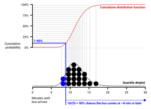
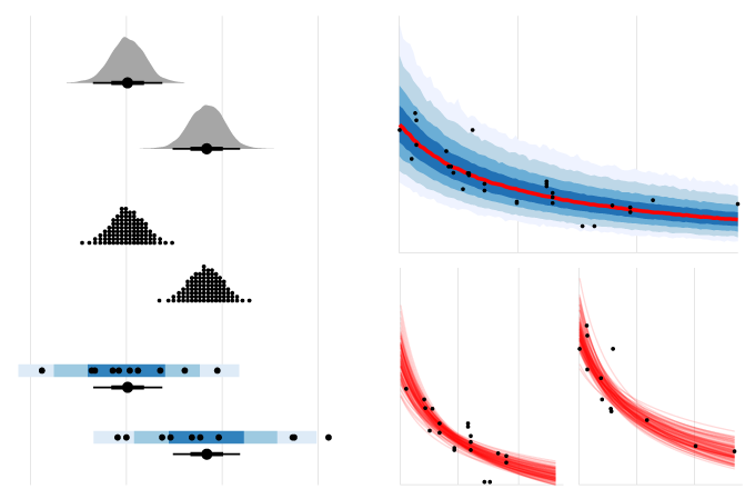
Most uncertainty visualizations are static and present probability continuously, as in density plots or CDFs, or they use difficult to understand constructs like confidence intervals. Presenting a set of draws in a static plot or over time via animation can help people understand what an uncertainty visualization communicates. We first demonstrated the value of hypothetical outcome plots (HOPs): animated visualizations in which each frame presents a draw from a distribution one wishes to convey, whether univariate or multivariate. Perceptual psychology shows that a frequency encoding does not require conscious effort to interpret, while judgment and decision making demonstrates how framing probabilities as frequency (e.g., 3 out of 10 rather than 30%) eases interpretation for novices and experts alike. HOPs naturally express joint probabilities and can be applied to any existing visualization technique as long as encodings can be made consistent across frames. We next introduced quantile dotplots: a discrete outcome representation of a probability density function which in experiments have shown lower error in uncertainty estimation and higher decision quality than other displays (such as intervals and densities). We have found that encodings like the quantile dotplot better support everyday decisions and reasoning, like when to leave for the bus and judgments or how reliable the effect reported in media coverage of a scientific study is.

Related contributions
Uncertainty in data analysis and model specification
Beyond the statistical uncertainty typically communicated in uncertainty visualization, uncertainty is an inherent feature of data analysis pipelines themselves. Data sources, transformation choices, and modelling choices all contribute to uncertainty beyond that captured quantitatively by any single model. How should we deal with these uncertainties during data analysis? How should we communicate these uncertainties once data has been analyzed? What alternatives are there to just reporting the one “best” model that can acknowledge these uncertainties?
Related contributions
A Bayesian Perspective on Data Interpretation
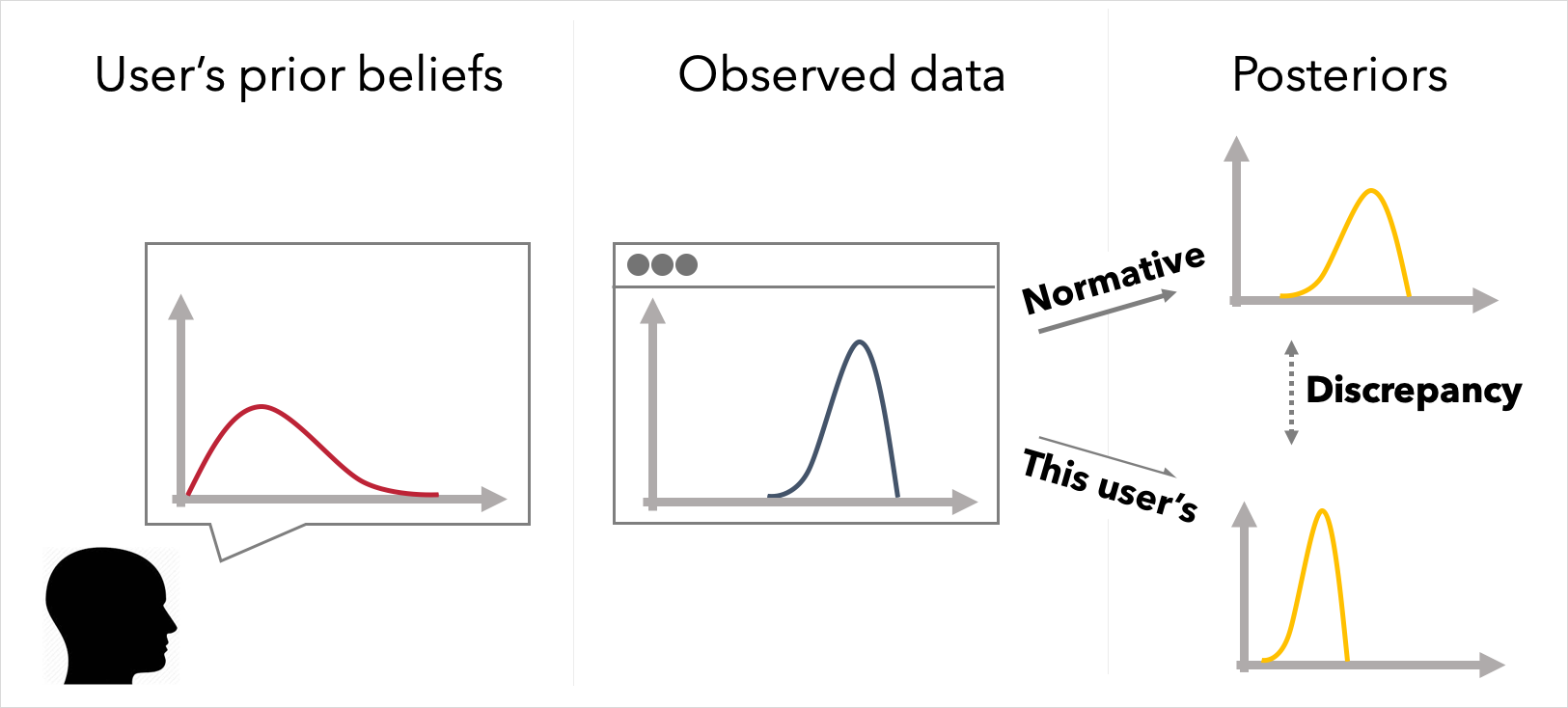
Users' prior knowledge undoubtedly impacts the conclusions they draw from data. However, visualization design and evaluation techniques rarely account for prior beliefs, and methods for evaluating visualizations and other summaries tend to rely on measures of how well a person can read a visualization or how they feel about it, rather than how much it affects their beliefs. We have developed Bayesian approaches to designing interactions with data and evaluation visualizations. We first showed how enabling users to articulate their predictions of data via graphical elicitation before they see the observed data in a visualization can improve their ability to understand and recall the data. Properties of the alignment between a person's prior beliefs, the data, and others' (visualized) beliefs can be used to predict how people will update their beliefs. We then demonstrated Bayesian models of visualization cognition that compare a user’s posterior beliefs about a visualized phenomena to normative beliefs under Bayesian inference. We show, for example, how a Bayesian approach provides more insight than other approaches into why some visualizations perform poorly, how individual belief updating from data is frequently noisy, and how Bayesian inference can be used to personalize how data is shown to a user to improve their updating.
Related contributions
Uncertainty Visualization in the Grammar of Graphics
Building uncertainty visualizations can be a pain. The Grammar of Graphics provides an abstraction for building visualizations generally, but it does not explicitly represent uncertainty, which can make it difficult to quickly prototype uncertainty visualizations, with plenty of room for errors. To better leverage the Grammar of Graphics to easily build uncertainty visualizations, we have developed an abstract grammar, the Probabilistic Grammar of Graphics (PGoG), as well as the PGoG and tidybayes R packages.
Related contributions
Automated Design of Visualizations and Data Summaries
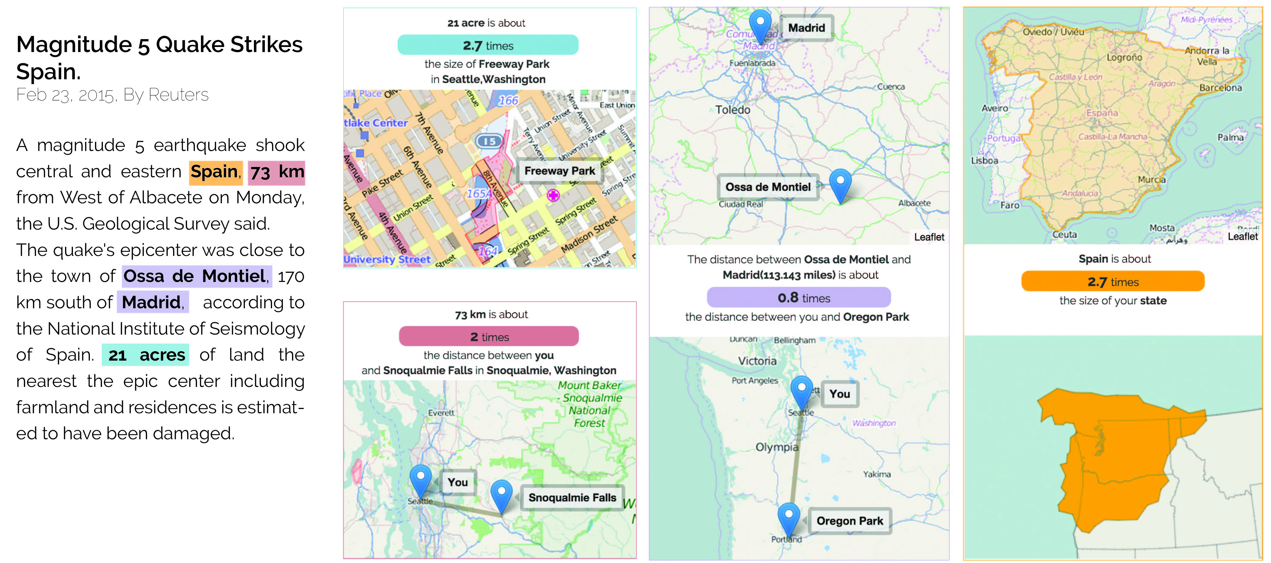
Expert data analysts and visualization designers rely on a number of implicit design strategies and guidelines to negotiate design trade-offs that arise in creating visualizations. Our work proposes approaches to learn and formalize design principles related to specific types of visualizations and data summaries, making it possible to automatically generate them. Visualization construction problems we have tackled include identifying design principles for multiple views and encoding them as constraints, auto-generating and visualizing measurement analogies (e.g., "300 gal is about the volume of a hot tub", "59 acres is twice the size of Millenium Park" for a reader in Chicago) on demand for news readers, automated generation and annotation of narrative visualizations, and automated reasoning about visualization sequence and similarity.
Related contributions
Visualization Literacy
Visualizations are often used to communicate data-driven information and have a variety of audiences. The message viewers get can vary depending on other factors (e.g., individual differences in perception or prior knowledge). To create visualizations that can effectively communicate to its audience, it is crucial to gain a better understanding in its viewers' ability to interpret visualizations. A deeper understanding of visualization literacy can also provide insights in related fields such as education, psychology, and cognitive science. We are exploring the complexities of visualization literacy by studying how people interpret visualizations, analyzing what factors could contribute to this skill, understanding how it might be different for varying levels of expertise (e.g., experts, novices), investigating how this skill is acquired, identifying the different aspects involved in interpreting visual information (e.g., critical thinking), and developing assessments aimed to measure the ability to interpret visualizations. Our investigations contribute insights in developing more comprehensive understandings, measurements, and interventions to improve visualization literacy.
Related contributions
Visualization Misinformation
Although visualizations are powerful instruments for communication, they can also become mediums used to exacerbate the spread of misinformation. Inappropriate representations of data can hinder the accuracy of the information consumed, which can lead to negative consequences such as poor data-driven decisions. Misleading visualizations can be the result of deliberate manipulations or careless constructions, and a better understanding of them is necessary to combat visualization misinformation, which is also applicable in fields such as journalism and public policy. We dive into the questions of whether viewers can identify misleading visualizations, what techniques can lead to such inaccurate representations of data, how these misrepresentations lead to misinterpretations, what skills are needed to effectively navigate around misinformation, and how these skills can be improved. By investigating (in)accurate data representations, we can gain a deeper and more comprehensive understanding of visualization misinformation, pave roads to avoid it, and build tools to confront it; all in an effort to cease the spread of and reduce people's susceptibility to misinformation.